
The Impact
The work helped celebrate StarCraft’s legacy through a range of cohesive visual expressions—from anniversary branding to merchandise and competitive identity. By bridging nostalgic elements with modern design execution, the project reinforced the franchise’s continued relevance across both its community and the broader esports landscape.
—
Creative Director : Erik Jensen
Producer : Andrew English
Producer : Caroline Wu Bonti
Sr. Production Artist : Ken Murayama
Sr. Graphic Designer : Martin Nguyen
Courtesy of Blizzard Entertainment
The Overview
As one of the most influential franchises in competitive gaming, StarCraft has a deeply rooted visual legacy spanning decades. This body of work explores how that legacy can be extended across commemorative branding, merchandise, and esports identity—balancing nostalgia with a modern, scalable design approach. The goal was to create designs that felt authentic to the franchise while remaining flexible enough to work across different applications and audiences.
01
–
20th Anniversary
& BlizzCon 2019
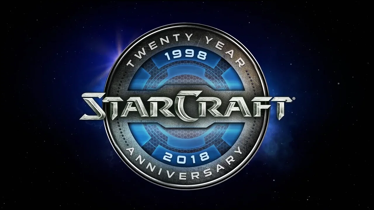
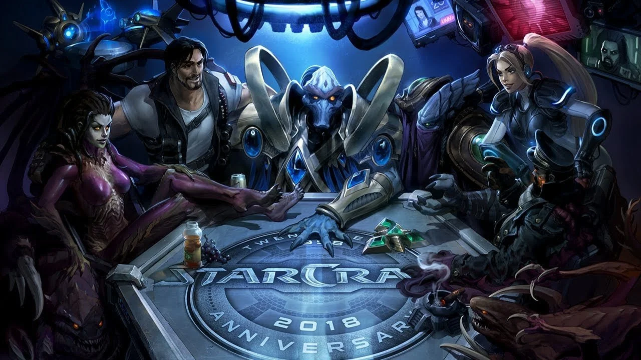
For the 20th anniversary of StarCraft, I developed a commemorative logo that balanced the franchise’s iconic sci-fi typography with a refined, celebratory mark designed for versatility across formats. Built with scalability and legibility in mind, the logo was quickly adopted across a range of merchandise including enamel pins, water bottles, and hats, becoming a unifying visual across anniversary touchpoints.
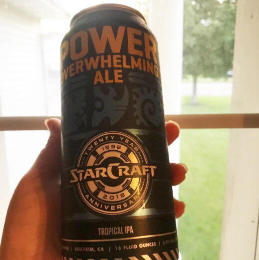
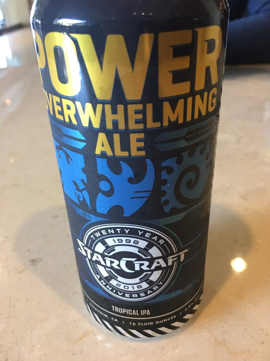
The mark also served as the centerpiece for a custom beer can label, where it was paired with a bespoke illustration that only Starcraft fans truly understood the hidden easter eggs. The overall art direction excited fans more than ever and was a success to extend the visual language into a more expressive, collectible format—demonstrating how a single identity could flex seamlessly across both brand and merchandise applications.


02
–
Korea Starcraft League
For the Korean StarCraft League, I contributed to the development of a logo that captured the intensity and legacy of competitive StarCraft while ensuring clarity across broadcast and digital platforms. Drawing inspiration from the franchise’s sci-fi aesthetic and Korea’s deep-rooted esports culture, the final mark balanced modern competitiveness with the heritage of StarCraft, resulting in a logo system that felt both culturally relevant and instantly recognizable.

